
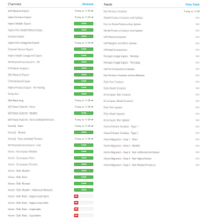
As our business continues to grow and bring other business units onto our PIM instance, the list for channels and feeds in the product details screen is growing very long. Below shows the list, side-by-side. But in reality they are both vertically stacked. Makes it challenging to view as well as scroll down to the recent activity section.
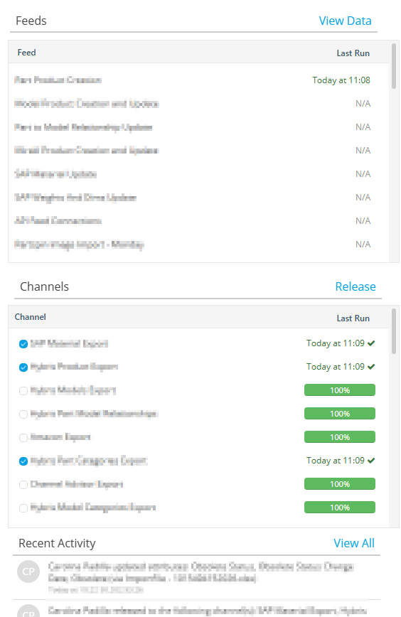
Suggest making it a scrollable list box. With maybe 8 visible before scrolling. Would make for better use of the vertical space and consistant with other areas within Pimberly where you have a similar list box (channels, feeds, data sets, etc.).
1
Comments
Please sign in to leave a comment.